Thursday 29 April 2010

Mystery Apparel - Shirt Layout Ideas 1


I think these layouts work a lot better than the ones with the type on the inside and underneath. The title being by the body copy seems to sit a little better on the shirt and seems to work for me better on the eye. Aesthetically I think these work better and it works with the concept more. I think this because it is quite a formal subject and these are quite formal columns, almost like newspapers. The other one looks a little too modernist for my liking. I also think these sit better on the shirt compared to the large rectangular box. The chest is the focal point.

Mystery Apparel - Shirt Layout Ideas


These are a couple of new layouts for the t-shirts. Instead of putting a large box in the middle of the shirt I have taken the element of the logo and swing tags and used the diamond shape for the middle of the shirt. I think it works well but the type/header doesn't fit too well within the diamond shape. I like the slanted type as it gives the layout something a little different.

T-shirt Formats


Universe Size, age and Depth


The Big Bang


Black Holes


These are the formats for the shirts. The dimensions are as tall as A3 but skinnier. I don't know if they work too well yet. I think maybe the designs are too skinny and tall. Maybe a more square image would work better. I will play around with the format accordingly and see which works better on an actual shirt.

Black Holes - Shirt Ideas


The ideas for the Black Hole theory speak for themselves. Both diagrams are quite recognized so whichever is used will obviousley be Black Holes. I like the first design more because it is a little more complex and the second diagram looks a little too much like an eye. 

The Big Bang - Shirt Ideas


These are the ideas for the Big Bang. I think that the first idea looks a little too much like a diamond even though it is probably the most popular and well known diagram for the Big Bang theory. The second one fits a lot better in the frame and is still a pretty recognized diagram for the theory. I do like the look of the second one better also as it looks a lot less like a diamond. It is unfortunate that the first one looks so much like a diamond as I think that the illustration is better.

Universe size, age and contents - Shirt Ideas


First ideas for the front of the shirts, the dimensions are slightly thinner than A3 but 420 mm high. The two diagrams are illustrations of how to explain the universe size, age and contents. The information underneath is the information about the diagrams. I prefer the first image as it is a little more promiscuous and looks a little more visually pleasing. The second one works better as a more obvious diagram and sits well over the image. 

Wednesday 28 April 2010

Mystery Apparel - Big Bang Theory New Symbol


I have another symbol to try out for the Big Bang Theory. I think this one really works also. It gives a better impression of what the theory is about

MYstery Apparel - Swing Tags?


This is an idea maybe for some swing tags? Thinking about it I probably prefer just to use the nicer logo's as swing tags so it all ties in. If too much are different it will look to fussy.

MYstery Apparel - Logo's 4


I think that the bottom one works. I think it could work in a variety of places and work on a variety of different surfaces. The top one looks like a sale. I wont be considering it.

Mystery Apparel - Logo's 3


Here are a couple more ideas that could work in different ares of the project. The other ones were designed specifically for the back of the neck on the shirt. These ones could go very well on a sleeve. bottom of the shirt etc. They could also be used in different situ.

Mystery Apparel - Logo's 2


Here are two more variations on the logo idea. The photograph behind the type in that shape work really well so it isn't just a block black. I really think it works better as it ties in to every design for the shirts and zines that I have started on. 

I have chosen to name it 'A Mystery Apparel' because there is a skateboarding make called Mystery. It also does shirts and shoes and everything so it is a bit too much of a similar name. I think that my name gives it more of a different feel, it doesn't sound as cheesy as just Mystery.

Mystery Apparel - Logo's


The first of the logo ideas. I did a few sketches that were kind of similar in a weird way. I really like the one in the diamond. It has been used a lot recently but it seems to work, it goes well with the type to. I think that making something different (the 'A') is a good ideas as it separates it from the other texts.

Tuesday 27 April 2010

Mystery Apparel - Shirt Illustrations - Universe


These are the third illustration sets and they are about the vast size of the Universe. I really like the look of the second illustrations. It is very very simple but would sit well on a nice image. The first one could be anything, so could the second but it is more specific that the first.

Mystery Apparel - Shirt Illustrations - Black Hole


These are the illustrations for the Black Hole theory. I like the second more than the first this time. The first one is too simple. Even though the second one is very simple still, it has more too it than the first and I think it will fit better than the first. The first looks too much like an eye.

I will have explanations of all the theories on the shirts also. They will make sense.

Mystery Apparel - Shirt Illustrations - Big Bang Theory


These are the initial ideas for the illustrations for the shirts. These diagrams illustrate the Big Bang Theory. They are very very simple but when placed over an image they may work very well. I think I am towards the top one. The illustration would go better and fit in a nicer frame than the horizontal one. I am also a fan of simplicity and think that it would work here.

T-Shirt Ideas


The first idea I have had for the t-shirt layouts. I initially thought that a huge picture of the atmosphere would be sufficient but from my research I have seen that t-shirts that are interesting when they have text and some sort of illustrations on. I feel that this is maybe something I can add in.


Another idea is overlaying text on the photograph to make it once again more interesting and not just a huge picture on a shirt. This one has a little more substance.


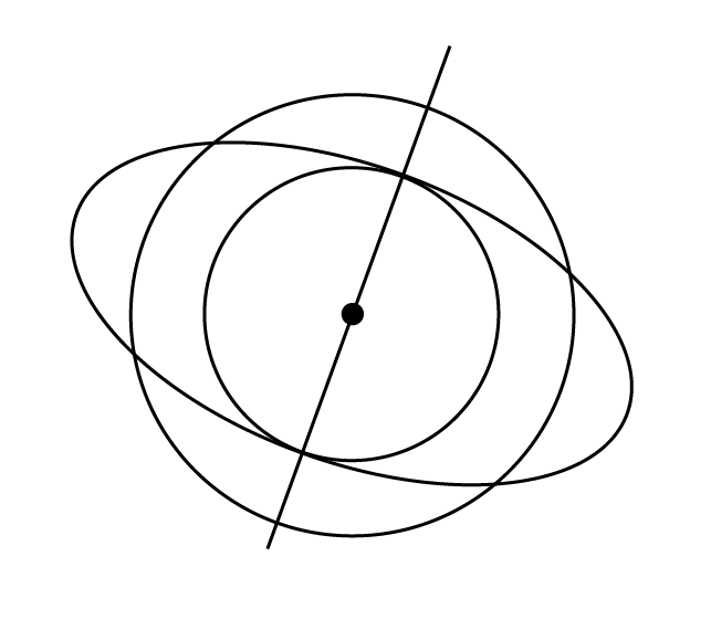
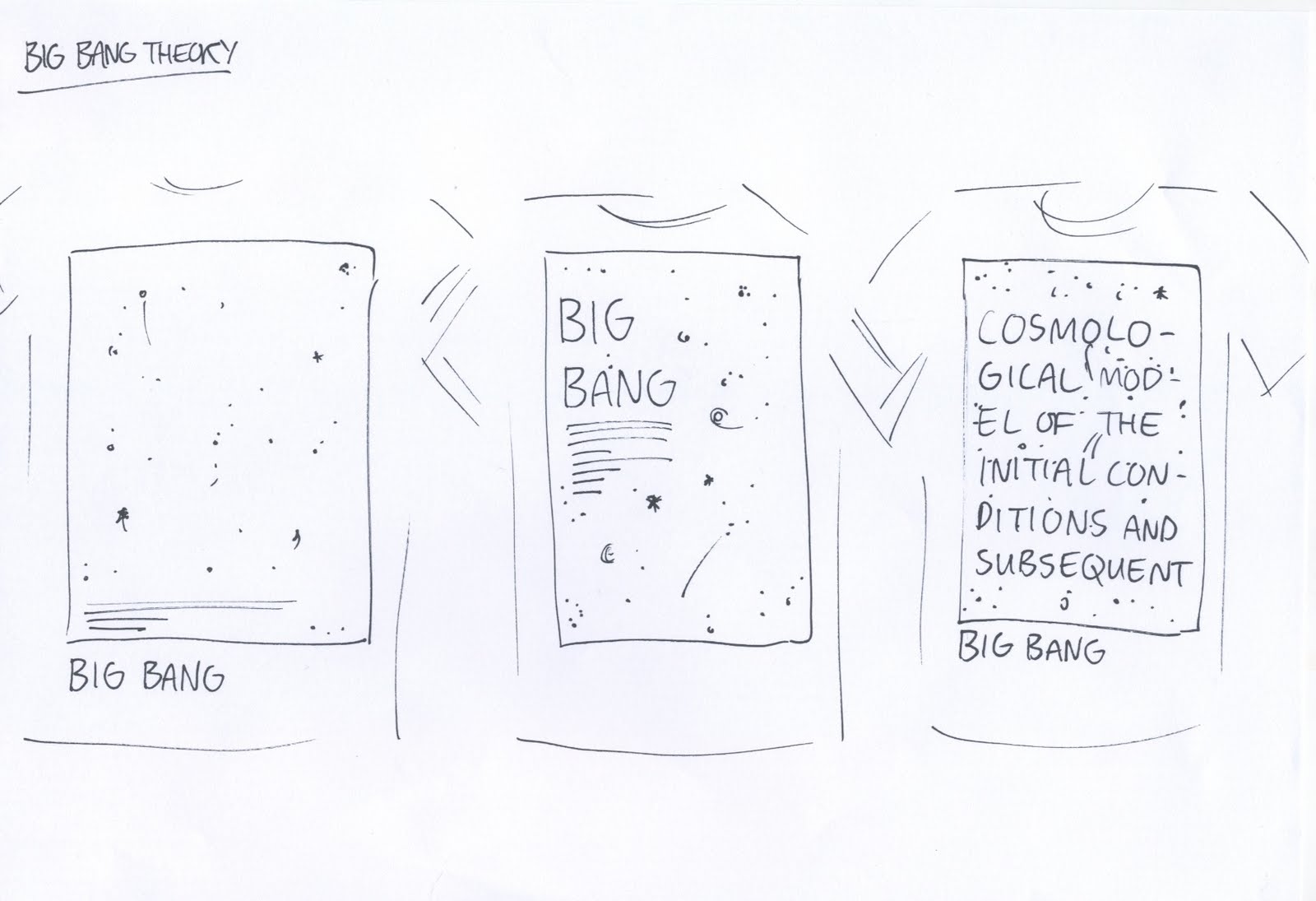
This is an idea of just using the diagrams that I found. These ones represent the Big Bang Theory. I think they work but not well enough by themselves, I think something else in there would work a lot better, make the shirt more interesting and make the theme more about mystery and unsolved stuffs.


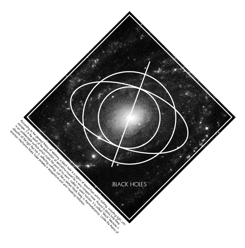
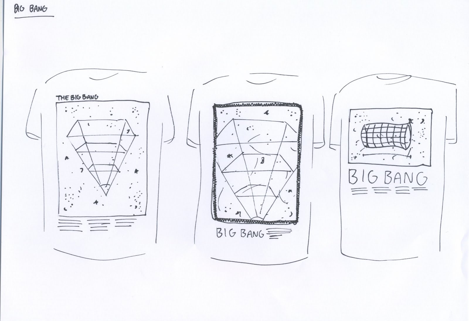
Here is an idea of using the diagrams over the images to make a really nice looking image. With the type and the body copy in it as well i think it could work a whole lot better. It is more interesting. The image would be dark and I think that the diagram should be a thin white line.


This is the same idea but with different diagrams for a different t-shirt/theory.
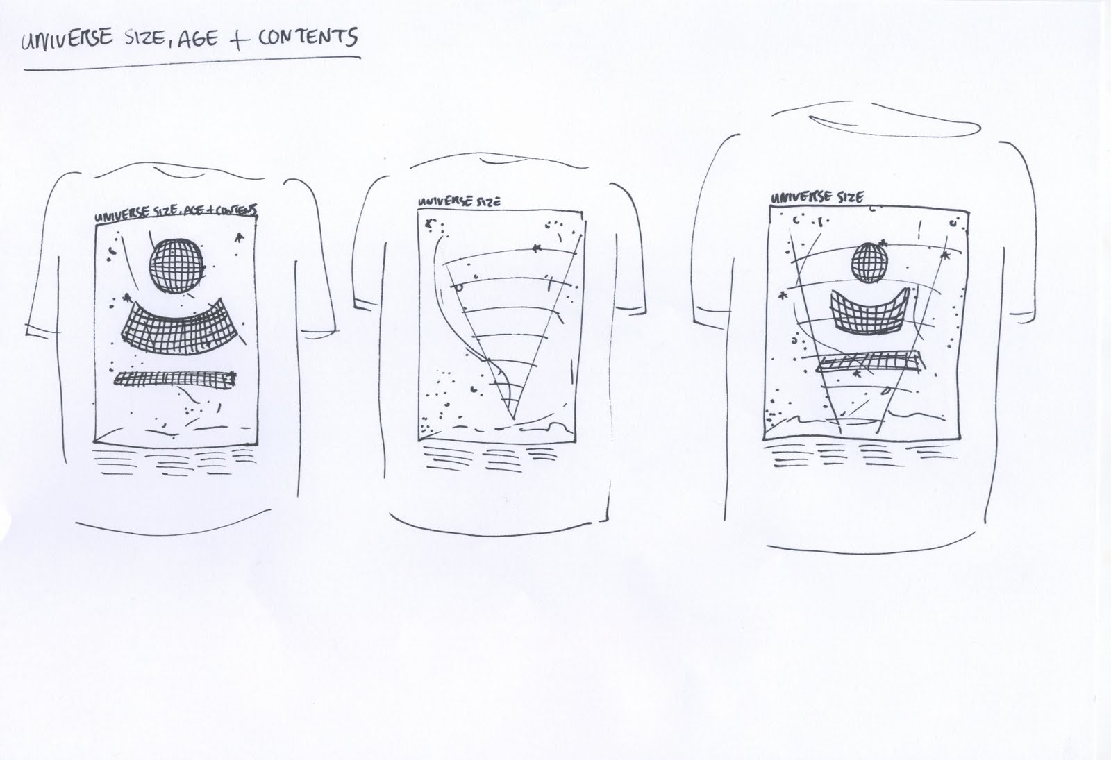


And the same here.


I think that what I have taken away from these tests is the realization that I need to have something a little more interesting than just an image or just type. T-shirts are about fun and aesthetics. These shirts are a little different as they are conceptually driven but I still want them to look as good as possible.


Thursday 22 April 2010

Universe size, age and contents


The Universe is very large and possibly infinite in volume; the observable matter is spread over a space at least 93 billion light years across. For comparison, the diameter of a typical galaxy is only 30,000 light-years, and the typical distance between two neighboring galaxies is only 3 million light-years. As an example, our Milky Way Galaxy is roughly 100,000 light years in diameter, and our nearest sister galaxy, the Andromeda Galaxy, is located roughly 2.5 million light years away.


Here are some pictures of deep space, the milky way, the universe and some diagrams about the ever growing universe. Interesting stuff.