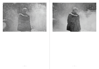
So this is the initial layout of the book. I have done it A3 size so that the book is A4, I feel this would show off his photographs more. I have kept the layouts simple, not changing many sizes so that it won't interfere with this photography. The type on the front is pretty dark and gothic, to go with the cover/content. I think it works really nicely and seeing a printed out version would be lovely to look at. After all, it is a photography book.
Wednesday, 12 May 2010
Subscribe to:
Post Comments (Atom)


No comments:
Post a Comment