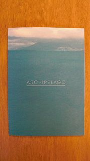
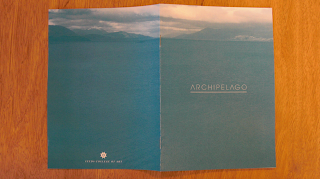
This is an initial idea for the Fine Art yearbook. Me, Angus and Tom all had different ideas of layout with the same concept. I am really happy with the outcome of it. It is mad simple and just two colour, but they don't have a lot of money or ideas so I think this is bang on. My layouts for the spreads aren't to good so we will make a mother child of all three of our designs and hope they Fine Art kids like them.
Monday, 8 March 2010
Subscribe to:
Post Comments (Atom)


No comments:
Post a Comment