The first idea I have had for the t-shirt layouts. I initially thought that a huge picture of the atmosphere would be sufficient but from my research I have seen that t-shirts that are interesting when they have text and some sort of illustrations on. I feel that this is maybe something I can add in.
Another idea is overlaying text on the photograph to make it once again more interesting and not just a huge picture on a shirt. This one has a little more substance.
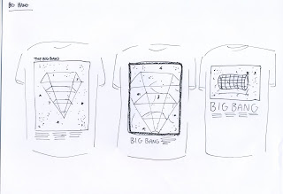
This is an idea of just using the diagrams that I found. These ones represent the Big Bang Theory. I think they work but not well enough by themselves, I think something else in there would work a lot better, make the shirt more interesting and make the theme more about mystery and unsolved stuffs.
Here is an idea of using the diagrams over the images to make a really nice looking image. With the type and the body copy in it as well i think it could work a whole lot better. It is more interesting. The image would be dark and I think that the diagram should be a thin white line.
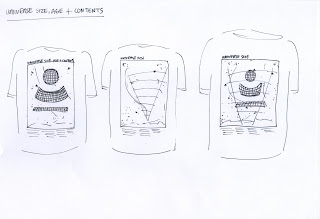
This is the same idea but with different diagrams for a different t-shirt/theory.
And the same here.
I think that what I have taken away from these tests is the realization that I need to have something a little more interesting than just an image or just type. T-shirts are about fun and aesthetics. These shirts are a little different as they are conceptually driven but I still want them to look as good as possible.


No comments:
Post a Comment